SFM’s visuals celebrate place, so the market becomes something people identify with year-round—a community gathering that happens to be a farmers market.
Suwanee Farmers Market
Year
2026
Role
Art Direction, Design
Tote Bag
Apron, Enamel Mug, & Sticker Merch
The impetus behind the logo is place. While this is a farmers market, the community and location are what truly drive the look and feel of the brand. The market takes place in a park surrounded by a library, fire station, greenway, gathering spaces, and more, making it much more than a place to shop. It’s a celebration of community. We wanted the logo to capture that sense of connection, so the wave reflects both the pedestrian bridge that crosses the park and the winding curves of the surrounding greenways.
Suwanee has a strong appreciation for art, especially through its public murals and sculptures. We wanted to bring that creative spirit into the logo by giving it a sign-painter feel, while the script “Suwanee” acts like an artist’s signature. This adds a personal, handmade touch that reflects the creativity woven throughout the community.
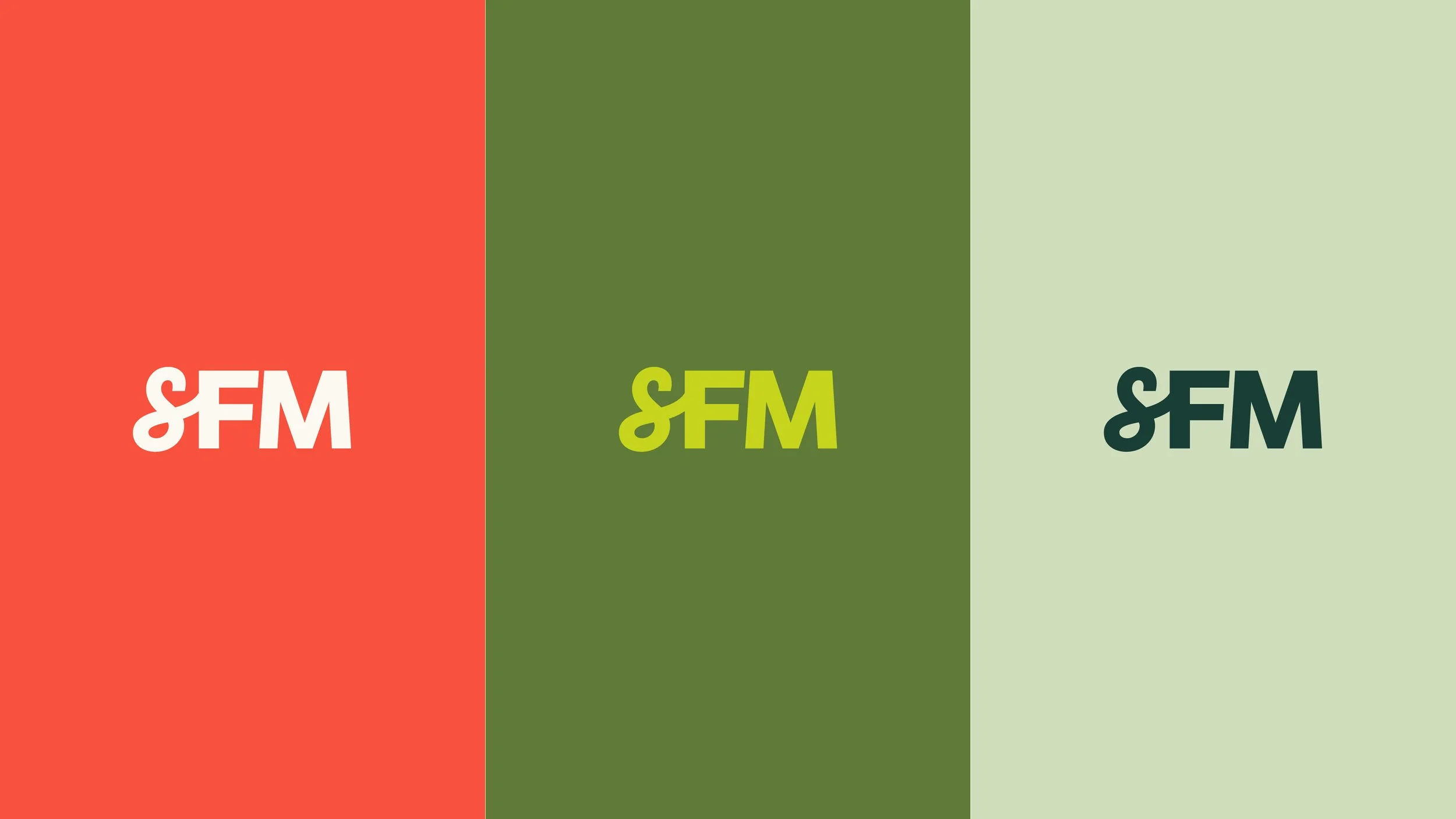
The logo mark gives way to a simplistic, scaled-down option of the logo, which is best used for small-scale instances like favicons or social profile pictures.
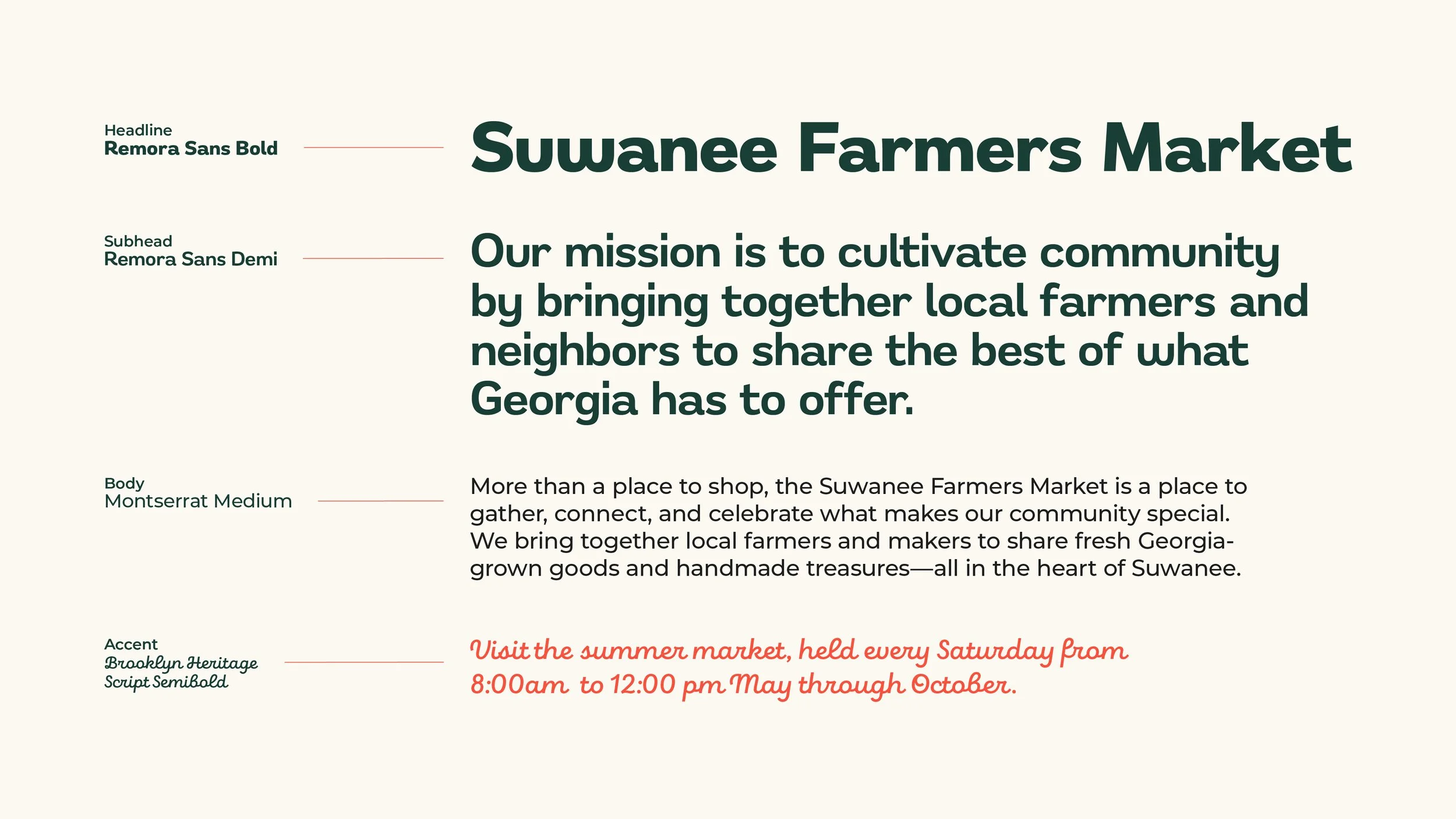
The sans-serif typography remains simple and readable, giving way to a cheerful, clean, and stable presence. For less frequent use, we have a casual script highlight font that gives even more depth and a touch of playfulness.
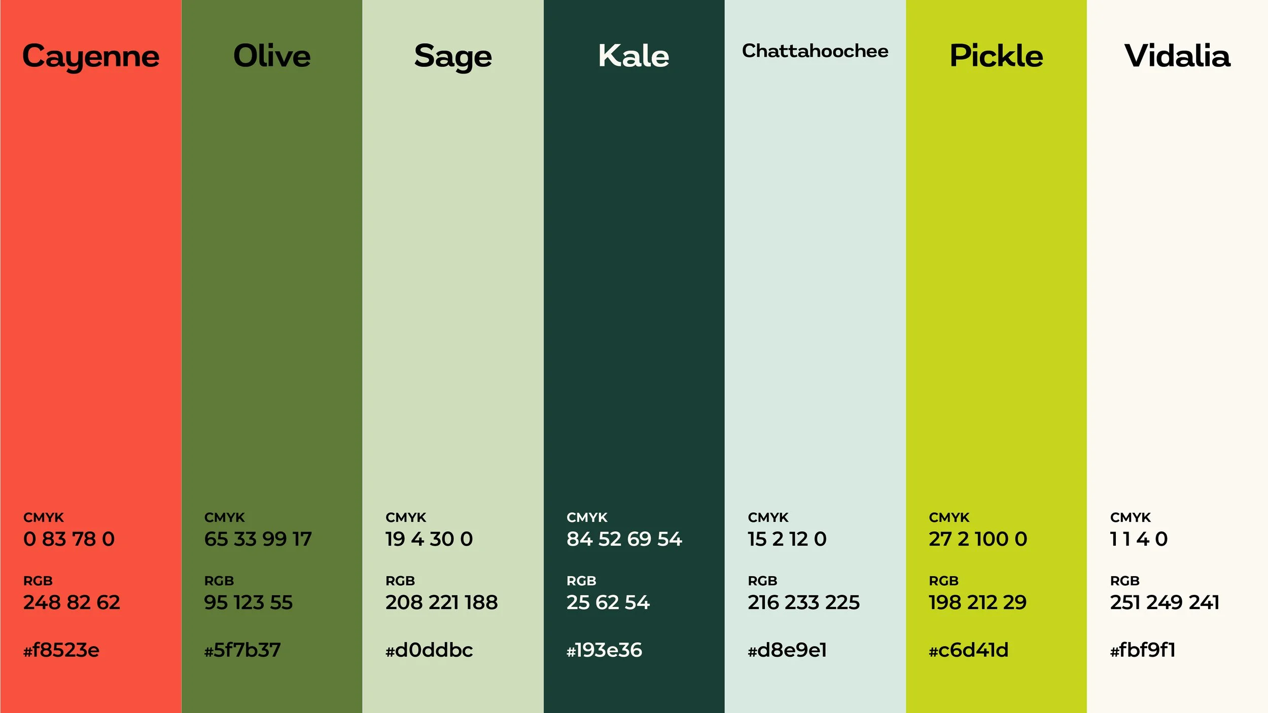
Seven hand-picked colors give the brand endless possibilities for flexible combinations, with each color thoughtfully named to celebrate the spirit of a Georgia farmers market.
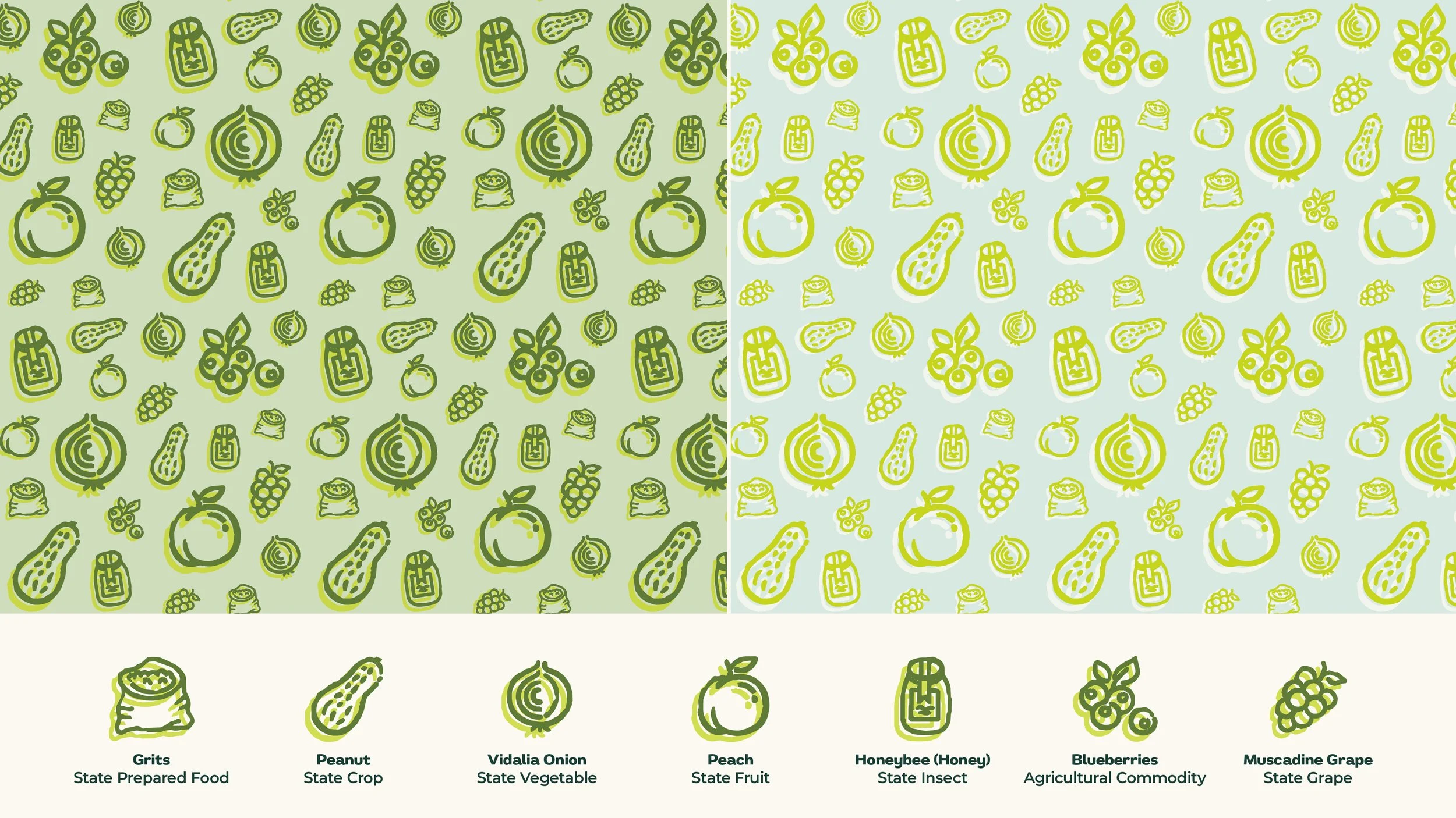
A full suite of custom icons and patterns brings the brand to life beyond the logo, creating more opportunities for recognition and giving the visual identity a little extra personality.